Final Project of Le Wagon Web Development Bootcamp
Voyage Planner
a mobile rails application

My Role
As it was a bootcamp focusing on web development, my role was primarily that of a front-end developer. After drawing up the original wireframes in the group, I stepped into the role of UI designer and transformed them into a high-fidelity prototype.
Team
Anastasiia Kulachok
Francisco Rodrigo
James Bunyon
Timeline
The Voyage Planner is the result of the final two weeks of the bootcamp.
Tools/ Language
The web application was built in the ruby-on-rails framework using Ruby, Javascript, CSS, and HTML as well as Figma for the product design. Due to the limited time frame, we had to choose whether to design for mobile or desktop and settled on mobile as we saw it more suitable for the use of our product.
During the Le Wagon full-stack development boot camp, I participated in a two-week final group project focused on building a Rails mobile application. Within the four-person team, we allocated tasks according to our strengths. My primary responsibilities revolved around front-end development, and I also took charge of designing the app using Figma.
We formed groups by pitching ideas and voting on them. As I love to travel and plan/research travel, I pitched the idea for an app that could store all information for your next trip, incl. tickets, reservations, itineraries, etc. Having done a lot of research on existing apps, I could not find anything that could check all the boxes that I needed and that convinced me with a good UI design so I pitched this idea and we started to develop it further.
Overview
-
Travel Planning can be stressful and chaotic, and trying to keep all information organized & in one place feels almost impossible. Existing apps never ticked all the boxes necessary for a good travel planning tool so we decided to take matters into our own hands.
-
An application that allows you to gather all travel information in one place and share it with your fellow travel companions. It combines existing tools in one place for an easier and more immersive travel experience.
-
Young travelers and backpackers have multi-stop trips that include many trip components such as accommodations, activities, and transport.
-
Time was the biggest constraint of the Voyage Planner project. In just two weeks, we were researching, designing and programming the application so we had to organize ourselves and prioritize features. Regarding the design, we were not able to build extensive nested component sets and stuck to prototyping the core user journey of our user. When it came to coding the features, we realized soon that we would have to drop some of them, such as implementing an expense list with the Splitwise API.
Some other constraints worth mentioning were our level of experience which only allowed for a certain scope of expertise as well as the language barrier in the team. Coming from four different nationalities and bringing different accents and levels of English to the team, we were speaking past each other more than once.
The Design Process
User Stories
To figure out the application's main features, we drew out our core user journey and wrote a list of every step our user would be able to take while using the application. From there, we started prioritizing features, as we knew we might not be able to fully program and design all features, the app could potentially have. This was not easy, as we all had some favorite features, we wanted to implement and different priorities on how to get to our final goal.


Designing our Prototype in Figma
The Le Wagon web development bootcamp designated only a few days to product design due to its focus on full-stack development. While we learned about the basics of Figma, building low-fidelity wireframes, and how to turn them into high-fidelity prototypes, it was left up to us to how much time besides the classes we wanted to spend working on our prototype before starting project weeks. As I fell in love with Figma on Day 1, I spent some extra hours turning our lo-fi wireframes into a prototype, that we could use as our baseline when starting the project.
At the time, I was not familiar with nested components, advanced prototyping, and some building variants so there were a lot of limitations linked to the prototype but it helped us a lot going into project weeks.
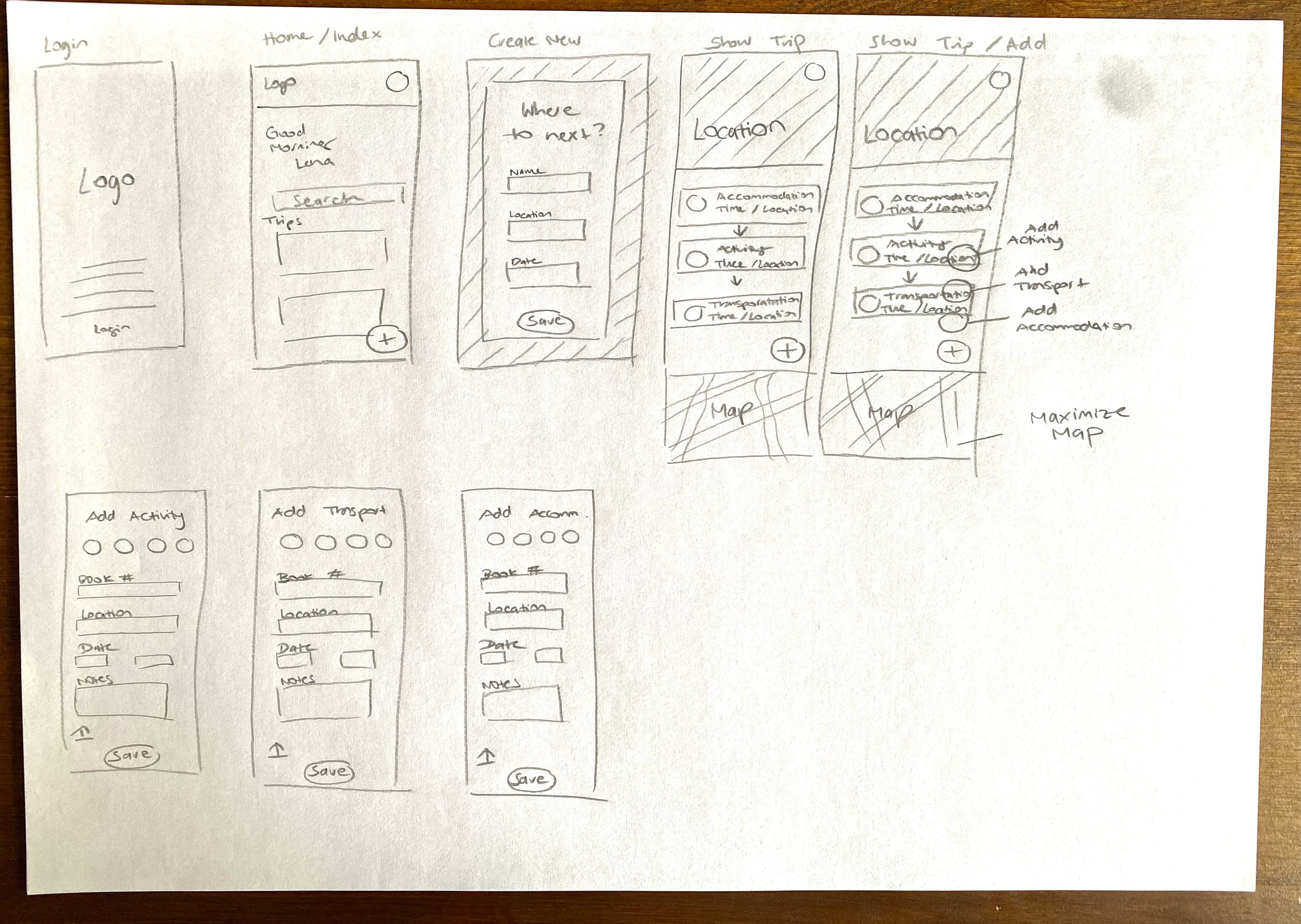

Figma Prototype
Accessible Color Design
A lesson I learned was to make sure our color palette was passing accessibility standards. I realized how strict these actually were as I would have never thought, some of the combinations would not pass the test, again learning that I am not my user, and that designing a successful, accessible product needs to be inclusive to everyone.

Design Goals
A seamless and intuitive user experience was at the core of our design goals for this project. In crafting the visual elements, we stuck to a simple blue color scheme and used the colors rather conservatively to allow for a lot of white space. We leaned on landscape and city photography to achieve our goal of getting the user excited to use the app and plan a trip.
The fonts and icons used helped to achieve our goal of making the design user-friendly and playful to underline the leisurely nature of the product. The goal was to use them effectively, ensuring users could intuitively grasp their functions without the need for labels, a critical aspect of enhancing usability.


The Final Result
Final Result (voyage-planner.com)
Constraints & Lessons Learnt
The two project weeks were a true rollercoaster of highs and lows. While progressing quickly in the first week, we ran into some issues in week two. Testing the app, it crashed and we spent hours trying to find a bug in the code that turned out to be a missing div. We were all frustrated and on edge, because we all had barely slept, had other things that needed to get done, and were upset that we would not be able to realize some of the features we wanted to implement. Adding miscommunication due to the language barrier to the mix (four different nationalities will have that effect), we were all not too happy with each other.
From a design/ front-end perspective, several details don't align with the prototype or could be better overall. Due to a lack of time and the emphasis on a working back-end and front-end code, this was the final result, which we were still happy with considering we were all Juniors and were doing something like his for the first time.
With a week more, the expense list through a Splitwise API might have become a reality, a chat function, or even a dark mode. We all learned the importance of focusing on features and being on the same page about them. That sometimes things take much longer than planned and going back to iterate is the nature of a dev team.
Voyage Planner - Rails App (best in mobile)