Watch me Grow 🌿
This section is dedicated to my work in progress: Little UI challenges, Web Design projects I've been doing, Learning resources I'm using, and more…
Content
click to jump to the section ↓
UI Challenges
Web Design Projects
My Portfolio Evolution
What I'm Listening to
What I'm Reading
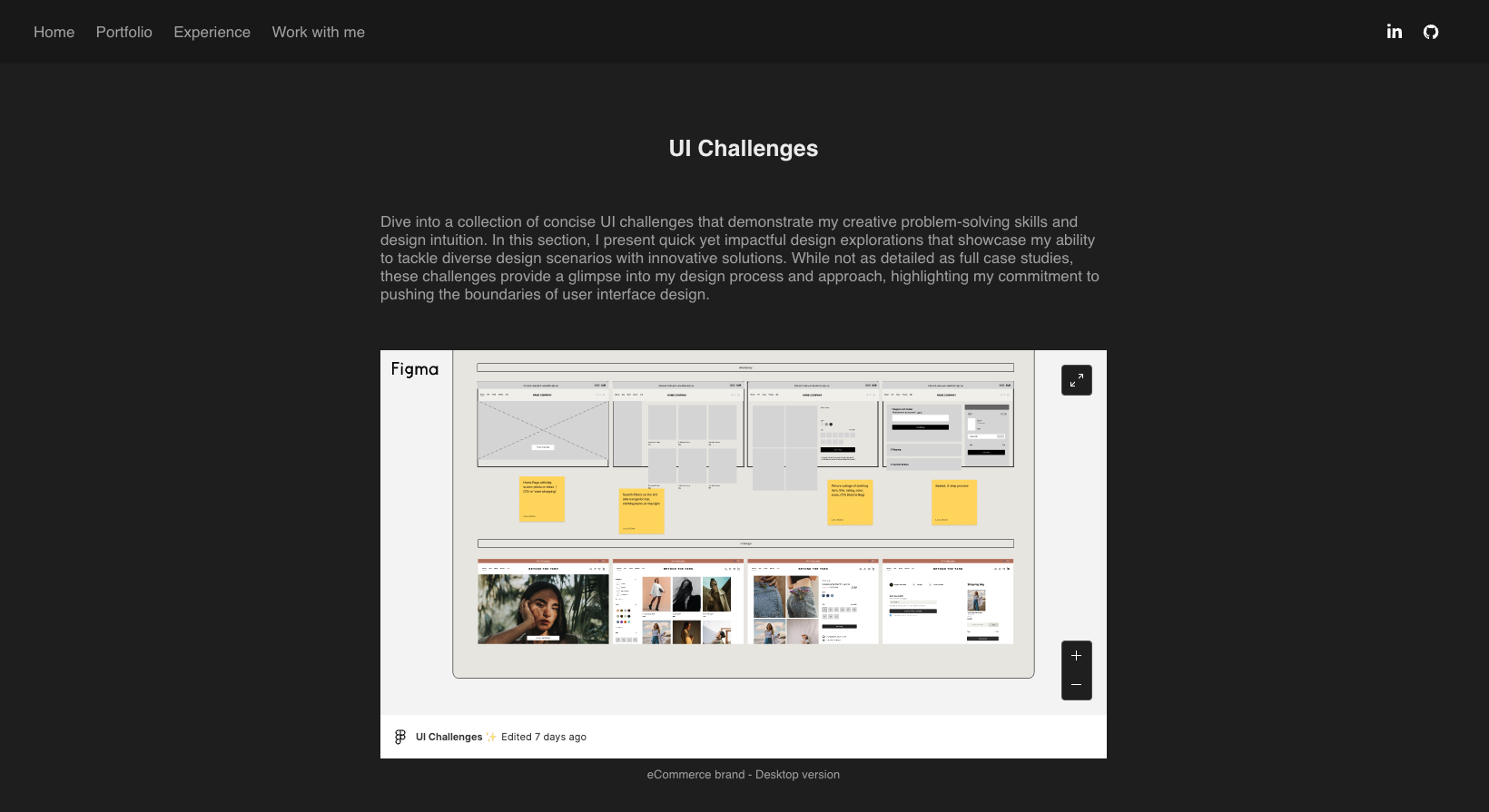
UI Challenges
A collection of concise UI challenges that demonstrate my creative problem-solving skills and design intuition. Their purpose is not necessarily a complex design process but getting more comfortable using Figma and learning about best practices while exploring innovative designs.
Designing a sustainable eCommerce Brand
Designing a Banking App
Designing an E-Mail Log-in
Web Design Projects
Friends and family have started to approach me about designing websites for them. While I don't see myself becoming a full-time freelance web designer, I still like doing it occasionally. I think what I prefer about product design is that the design is not too much about how it looks subjectively but how it works. With a personal website, there's much more room for personal taste and creative little outbreaks. One big takeaway I'm learning whenever it comes to web design is: that I am not the user. Just because I like the look of something, or prefer a certain color, this does not have to be the case for the person I am designing for.
Goal: A website to offer psychological online consulting and resiliance coaching. Using warm colors to create inviting and trustworthy atmosphere
Learning: Understanding what the client wants, understanding that web design can be more subjective than product design.
Tool used: Squarespace
My Portfolio Evolution
As a junior designer, one of my main challenges has been to create a strong portfolio. I have spent hours researching, attending lectures, reading, asking for feedback, and iterating on repeat. I built my first portfolio in Adobe Portfolio showcasing my projects and my experience but decided to throw it all out the window and start a new portfolio (you are looking at it) after a couple of months, because I felt it was lacking usability and was thinking about the following questions:
Who am I making this portfolio for? Hiring Managers, recruiters, and designers. What are their needs? Navigating and skimming my portfolio quickly, easily finding the information they are looking for. A balance between depth and quality over quantity.
One learning I took away is not erasing my "failed” designs. When I first started, I did not keep my failed designs, simply overwrote them with better solutions but failed to see the importance of keeping them for telling the story of how the product came to be and why the earlier drafts did not work.
I was also focusing too much on craft and less on strategy. The interplay of personality, clarity, and concision when presenting a case study remains a big challenge but I am committed to becoming a better storyteller.
One big change I made is how I introduce the reader to the case study, listing some key information, e.g. roles, timeline, goals, and background. Another big change is the presentation of prototypes. In my first portfolio, I stuck to screenshots to click through. Unfortunately, this way all prototyping through nested components got lost and I decided to opt for video presentation in my new portfolio. Another big change I made was switching my new portfolio design to light mode/ ivory color, as I conceived it to be easier on the eyes and better to navigate. I realize that this is often a rather subjective preference but from testing it on several people and asking for their opinion, the majority agreed that they liked the light mode better.
To keep a long story short, this is why I decided to include my old portfolio as a micro case study in my new one.